Thursday, 8 November 2012

Logo Design - The Kitesurf Centre

In 2008 the Brand "The Kitesurf Centre" was born. The logo at the time was a collaboration of many while putting their own twist on it. The design has used the idea of sights or circle around the side from Liquid force at the time, a kite similar to that used by Rodwe and a well shaped waves used in many surf and kitesurf brands. The finished item was a sketch drawn in an airport but still one of the most effective logo's I have seen whether planned or not, split down there are three parts. The Kite, the wave(surf) and a circle or sights which then place the other items and target in the centre.

Here shows a 3d representation of the logo which I have put together and has been used throughout the website and marketing material for a couple of years.

Each year we have kept the centre looking fresh with a new cite and even upgrading the building and continue to do so therefore we decided that this was also a good plan to do for the logo
I was given the task of looking into a new logo and the creation so new stickers and other such marketting material to go with it.

Following the basic idea of the three parts I did not want to change it too much, it had been a variety of colours throughout the couple of years so colour choice was very open but it had to work in more than just the one or two.

I initially looked at changing the entire design such as the wave and kite or even adding a kitesurfer to it however none of these created the correct effect.
Instead I decided to change the exterior circle or at least the sights. With the whole concept revolving around  wind and the weather that is what stuck in my head, in this design I try to put across the idea of sun and the rays produced while also giving the effect of wind with the rotation of these giving a slight eye of a tornado feel to it.


This design worked well and we were pleased with the outcome as it also allowed the use of the name in the logo if needed or absent when not.

The design was then used for much of the marketing material and even placed onto clothing. One of the key changes we had made in the centre was hiring a large number of instructors so to show us as a team we had staff hoodies and t-shirts made to be worn. Here is some of the intial designs for the hoodies however we eventually went for this initial design on the front and the surfer riding along on the back with brands running down the arm in a cub badge style.
Here you can also see how the design also works well with other colour and without the brand name written on.
Next on the list..Stickers


Star Luxe Cosmetics

Star Luxe was a short project that I took on as a favour.
A family friend was starting a new brand and needed some 3d renderings and presentational material.
This is the type of information I was given so you can see the design process.


From the few slides I was sent I then extracted as much information as possible to develop the range, throughout the process I continually emailed the client to keep her up to date and used Dropbox to keep her clear on the alterations made to the designs and the renders produced. I found this was much quicker than emailing and allowed far larger files to be transmitted which meant a clear understanding of size and colour rather than a compressed low res pic.
Here are a few examples of how I developed this.

Purple Mascara.

Lip gloss packaging.

Lip gloss.

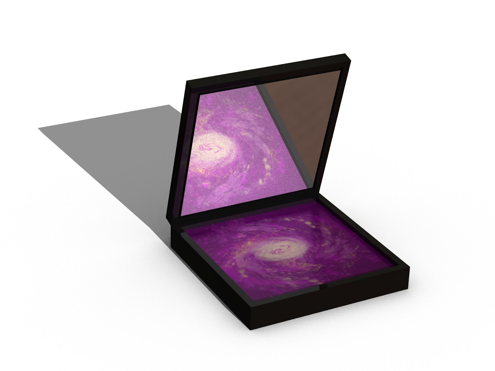
Powder box.

The designs were pretty near to how she asked however the changes are all ones which I recommended and although not initially liking the idea once seeing it all together they were sold. This was most apparent with the powder box where I first sent them an image I had created for the powder, they had asked for gold with a slight spiral of purple to give a galaxy and stars feel to it. I had a quick play with the gold, realised I was not a fan and that the gold would look better as the centre and the purple replacing what would be good as the black of a galaxy. Seeing the jpeg they asked if I could redo it but before I fulfilled their request I placed it into the solidworkds designed box with the reflection and waited for the reply..They loved it.

Real Beauty health spa (MR Design)

A project created for a friends family member, they needed a very simple website created for their beauty salon/ spa.
As a designer this was simple enough for me to come up with the concepts and then my flatmate would create the coding and put the pieces together.
We thought this could be a good practice and if it worked possibly go into webdesign together, I put our first names together to form MR and then added design at the end, simple...company name done - MR Design.

Initially I send them a few colour schemes as without going to the shop and speaking to them it was difficult to obtain information about them as their emails were not very specific.
Here are some of the colour schemes I sent:


I was hoping they would use one of three colour choices, for this reason I places it at the top of each box. I also mentioned that if there were any colours in one and not in the other then to let me know and we could mix and match a little. They decided to go for colours in the earth box (top left) however the 3rd strip down which was not one I would have chosen myself however I followed their brief and created a home page.


The design was just a quick concept so that they might see how it would look before I created the other pages. The font I used was Helvetica however this may have been changed depending on if they already employed a specific font for their other items, leaflets, banners, shop front etc.
As it may be apparent I didn't completely to the colours chosen, when working with this I found that it needed something to lighten it  and clean it up so added the light blue but still with the earthy feel to keep it in the correct area. The company had a few issues and so the whole website plan fell through leaving us with nothing, first lesson of design take some type of deposit or just be lucky.

Water splash

1.   2.
I have often seen photo's where items have been dropped into water and not known if it is real or photoshopped. One way to find this out and also learn a new skill was to try myself. I found a blog that showed about water and how to manipulate a page to show a flow going in and splashing back.
These three pictures show a quick explanation of how I reached the final image.
1) The water itself, background white blending with a circular gradient to grey/blue. The impact area should be where the gradient is white so make a horizontal blue box here and then manipulate the top with warp, smudge or anything else you like to soften the edge.
2) This image is a layer created using filter and then fibres, pull this into the splash shape, add a slight Gaussian and motion blue with it splaying out at the edges.
3) Final image, use fibers but with dark blue rather than black, twist this around using distort and warp. I also used an overlay for this to darken it slightly, remember to place this later behind. The top of the water must also be edited with a similar method, add a couple of light spots and blur/blend with the blue and fiber layer. make sure to delete the centre where the splash has hit.
3.
The Final Image
I hope this is a quick rough guide to see how to manipulate water.

Wednesday, 7 November 2012

77 Project and STRYDER Boards

I have recently started design concepts for two board companies, 77 Project and STRYDER boards.
77 are a polish brand that have created a range of snow and kiteboards and also ski's for the last few years. Their facebook page is almost more informative than their website as it shows designs from many previous years both can be seen here:
http://www.facebook.com/pages/77-PROJECT/178433682245859?fref=ts
http://77project.com/


Stryder is an extremely new company and a local board shaper to the kitesurfing business I co-run with my brothers (thekitesurfcentre.com)
He has currently decided upon the shape of two boards a freeride and a freestyle/wakestyle board, each has a basic design that he would like to keep for the first year however will be needing something fresh for next season.

The Brief:
Neither companies were extremely precise with what they would like, with Nik Stryder is was a verbal discussion with the key point being that he would like to keep the stripe/block design, which is on his current board throughout the range even if it is subtle.
77 Were a little more business like with an actual brief being sent that they had used in a competition previously in the year but it was a good start:

What we expect about new graphic:
- colours could be changed,
- colllection should have an accent and be a slight continuation of lastlest years, but graphic design should be brave,
- logo design could be changed,
-  tranpsrent graphic could be used to show carbon, cevlar and wood core,
- in kitesurfing boards we do handle footpads and footstraps (black&white) and we can print our logo on a footstraps and handle


- plus you can design your own project (your vission of 77 brand)

The key this that 77 have used throughout the brand is RASTA, I understand that they want to give their product an appearance of free and easy going however it does not fit with them or the sports to which they are approaching. The owners and designers are Polish and neither Snowboarding or kitesurfing takes place in Jamaica and only has slight links.

I went away and started some designs on snowboards and kiteboards that would be relevant for both companies as a rough guide.


 I used some of the information both companies gave to me, however I also show other colours and design styles so that they can see other directions that it could go.

Thursday, 12 January 2012

Going away

I am off travelling the globe to find some inspiration and to have another excuse to have a fun time.
Keep up to date with my whereabouts and activities and my do's and don'ts that I learn on the way on my travel blog:
http://there-and-back-again-a-hobbits-tale.blogspot.com/

If I take some good pics or come up with some great ideas then this might still get some updates too.
Rupert